Part 2: Updating Packaging
It is no secret – and no surprise – that the Scotch Whisky industry is looking to reimage itself. While the industry aims to maintain its status as the epitome of quality, purity, and premium in the whisky world, it also needs to appeal to a new generation of drinkers, and that means shedding its associations with tartan-clad Scots, the old boys’ club, and your grandfather’s stuffy drinks cabinet. With Bourbon, Irish, and Japanese whiskies all on a tear, Scotch can ill afford to fall behind, especially as these other whiskies gain favor among younger consumers.
We recently explored how the industry is introducing bold flavors to reach appeal to Millennial taste profiles . Next up is how the category is shaking up traditional packaging rules to stand out from the crowd.
Packaging
Much like beer before it, the Scotch industry is moving away from the traditional into more creative, clever, and modern pack designs to better catch the eye and distance itself from the staid traditions of the past. Gone are the days of tartan patterns and of bland paper labels.
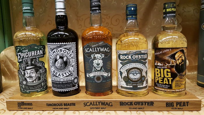
Today, we see Scotch brands bringing much more personality into their packaging. Blender and bottler Douglas Laing employs a cartoonish, playful design aesthetic to distinguish itself, while still tying in imagery unique to or descriptive of the distinct appellation of the Scotch’s region:
Similarly, “That Boutique-y” Whisky Company creates a comic strip style label for each of its independently bottled Scotches that it feels captures the essence of the liquid inside.

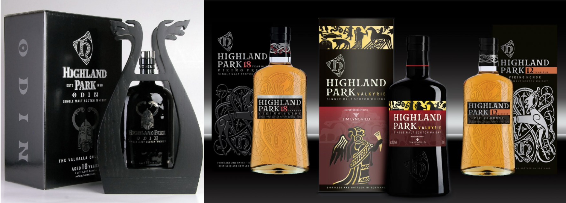
Others have chosen to lean more into their unique heritage and carry that through to their packaging. Highland Park in particular is known for strongly emphasizing its Viking Heritage, This heritage has been reflected in recent limited releases and 2017’s redesign of the full line, which are a far cry from the traditional look and feel of Single Malt:
Even the industry’s leader, The Glenlivet, has turned its attention to catching the eye of younger drinkers. Their recent hit product, the Founder’s Reserve, comes in a beautifully eye-catching, Tiffany-esque, pale blue box, which has been massively successful at recruiting Bourbon and other whisky drinkers to the Single Malt category. Hoping to replicate this success, with a limited edition pack for its core SKU, The Glenlivet 12 year in a garish yellow box that traditional Scotch drinkers would likely find more befitting of Malibu Rum or a can of Mello Yello soda – but this is perhaps the context in which they view this younger target.

The success of many of these moves remains to be seen, but there can be no doubt that Scotch Whisky no longer fears colouring outside the rigid lines of its past. It is critical for brands today to find the right mix of provincial, brand-related story and eye-grabbing packaging to stand out among the sea of options and tap into a younger audience that craves deeper connection to their product.



1 Comment