#1 Cornetto – Own the Cone
The Brief:
The brief was to reposition Cornetto to target a more youthful audience. But we needed to do this without alienating the current consumer.
We had to move the product away from the occasional season-led treat purchase into the impulse snacking space.
The new design needed to work globally.
The Change:
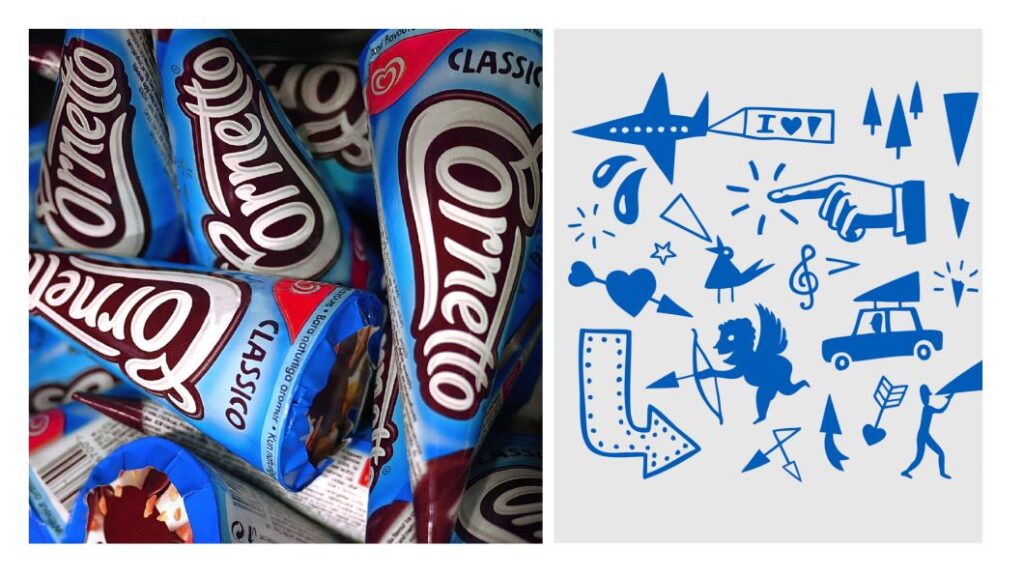
Cornetto is the iconic cone. We wanted to reinforce that. To own it.
We took the iconic cone shape of the product and used it at the heart of the logo redesign.
Taking inspiration from snacking and confectionery, we ran the new logo vertically down the packaging to ‘Own the Cone’. This created maximum stand-out within the freezer aisle.
The first logo rebrand in 50 years.
By:
Sarah Turner